Ideation | Art direction | Brand development | Brand storytelling | Creative direction | Creative leadership | New product rollout | Strategy
Sxollie Cider
Behind the brand was a positive story of two entrepreneurs hustling to reinvest in Africa.
Our aim was to create a brand that reflected true African design. The X in the name and logo represented the hustle of the Continent. It celebrates the ‘sxollie’, the challenger that rises above the issues of the day.
We were approached by Crafty Brands to create an identity for a new cider they wanted to launch in Africa.


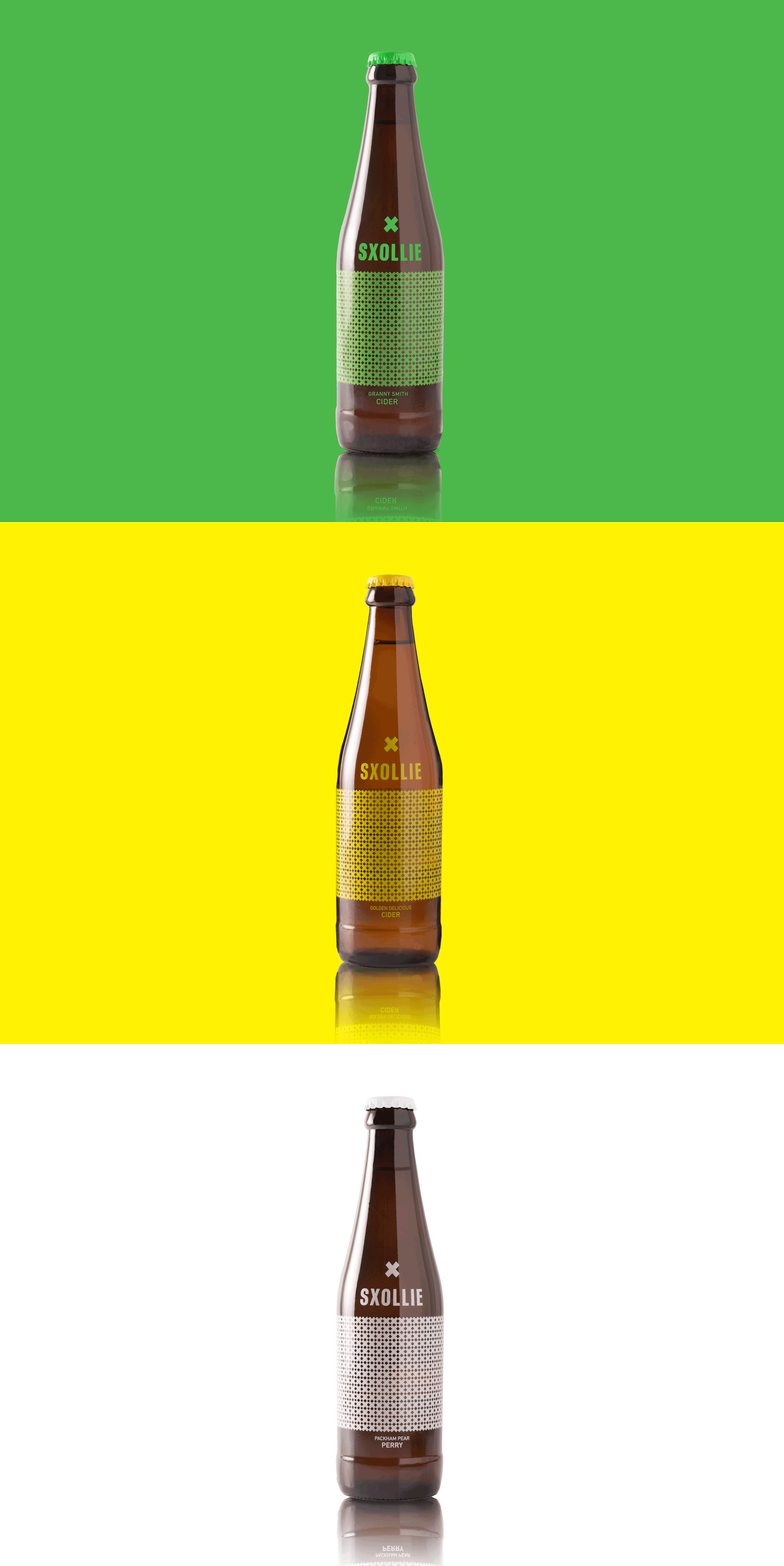
The pattern of Xs created a distinctly African pattern that signified the boundary/fences that the hustler has to overcome every day.
The single X on the bottle represented the apple core because the cider is made from real apples, not concentrate.


To ‘sxollie’ means to hustle, to do the best with what you have and to end with more than you started with. From Greek skolios "crooked", widely used in Cape Town, originally applied by Greek convenience-store owners to street-youths who hustled and shoplifted.
The design is printed directly onto a brown glass bottle with a single colour print to signify the single-varietal apple used in the cider. Yellow (Golden Delicious), Green (Granny Smith) and White (Packham Pear). The colour palette is undeniably African with bold strong colours.


In Africa, historically, green bottles were used for more expensive beers and ciders to indicate status. Sxollie is reclaiming the brown bottle with a premium yet cheeky design to hustle its way to the top of the South African cider market.
We drew a lot of inspiration from African design to create a truly Afropolitan brand. The aim was to show a brand that is proudly African in a way that is not sentimental, touristy or schmaltzy.

